Uniforms summing to a uniform

A code golf question by xnor led to the following nice problem: let X and Y be 2 random variables such that marginally, X\sim U(0,1) and Y\sim U(0,1). Find a joint distribution of (X,Y) such that X+Y\sim U(\frac12, \frac32).

You need X and Y to be negatively correlated for this. I wrote the problem in the lab coffee room, leading to nice discussions (see also Xian’s blog post). Here are two solutions to the problem:

1. Let X\sim U(0,1) and Y = \begin{cases}1-2X\text{ if }X<\frac12\\2-2X\text{ if } X\geq\frac12\end{cases}.  Then:

  • Y|X<\frac12 and Y|X\geq\frac12 are both U(0,1), hence Y\sim U(0,1)
  • X+Y|X<\frac12 = 1-X|X<\frac12\sim U(\frac12, 1) and X+Y|X\geq\frac12 = 2-X|X\geq\frac12\sim U(1, \frac32) hence X+Y\sim U(\frac12, \frac32)

2. A second solution, found by my colleague Amic Frouvelle, is to sample (X,Y) uniformly from the black area:

cuef8-1

I quite like that the first solution is 1d but the second is 2d.


On Unbiased MCMC with couplings

Pierre Jacob, John O’Leary and Yves Atchadé’s excellent paper on Unbiased MCMC with couplings will be read at the Royal Statistical Society tomorrow; Pierre has already presented the paper on the Statisfaction blog.
Although we won’t be present tomorrow, we have read it at length in our local reading group with Xian Robert and PhD students Grégoire Clarté, Adrien Hairault and Caroline Lawless, and have submitted the following discussion.

We congratulate the authors for this excellent paper.

In “traditional” MCMC, it is standard to check that stationarity has been attained by running a small number of parallel chains, initiated at different starting points, to verify that the final distribution is independent of the initialization — even though the single versus multiple chain(s) debate errupted from the start with Gelman and Rubin (1992) versus Geyer (1992).

As noted by the authors, a bad choice of the initial distribution p_0 can lead to poor properties. In essence, this occurs and remains undetected for the current proposal because the coupling of the chains occurs long before the chain reaches stationarity. We would like to make two suggestions to alleviate this issue, and hence add a stationarity check as a byproduct of the run.

  1. The chains X and Y need to have the same initial distribution, but different pairs of chains on different parallel cores can afford different initial distributions. The resulting estimator remains unbiased. We would therefore suggest that parallel chains be initiated from distributions which put weight on different parts of the parameter space. Ideas from the Quasi-Monte Carlo literature (see Gerber & Chopin 2015) could be used here.
  2.  We also note that although the marginal distributions of X and Y need to be identical, any joint distribution on (X,Y) produces an unbiased algorithm. We would suggest that it is preferable that X and Y meet (shortly) after the chains have reached stationarity. Here is one possible strategy to this end: let p and p' be two distributions which put weight on different parts of the space, and Z\sim Bernoulli(1/2). If Z=0, take X_0\sim p and Y_0\sim p', else take X_0\sim p' and Y_0\sim p. The marginal distribution of both X_0 and Y_0 is \frac12(p+p'), but the two chains will start in different parts of the parameter space and are likely to meet after they have both reached stationarity.

The ideal algorithm is one which gives a correct answer when it has converged, and a warning or error when it hasn’t. MCMC chains which have not yet reached stationarity (for example because they have not found all modes of a multimodal distribution) can be hard to detect. Here, this issue is more likely to be detected since it would lead to the coupling not occuring: \mathbb E[\tau] is large, and this is a feature, since it warns the practitioner that their kernel is ill-fitted to the target density.

Reproducing the kidney cancer example from BDA

This is an attempt at reproducing the analysis of Section 2.7 of Bayesian Data Analysis, 3rd edition (Gelman et al.), on kidney cancer rates in the USA in the 1980s. I have done my best to clean the data from the original. Andrew wrote a blog post to “disillusion [us] about the reproducibility of textbook analysis”, in which he refers to this example. This might then be an attempt at reillusionment…

The cleaner data are on GitHub, as is the RMarkDown of this analysis.

library(usmap)
library(ggplot2)
d = read.csv("KidneyCancerClean.csv", skip=4)

In the data, the columns dc and dc.2 correspond (I think) to the death counts due to kidney cancer in each county of the USA, respectively in 1908-84 and 1985-89. The columns pop and pop.2 are some measure of the population in the counties. It is not clear to me what the other columns represent.

Simple model

Let n_j be the population on county j, and K_j the number of kidney cancer deaths in that county between 1980 and 1989. A simple model is
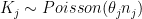
 K_j\sim Poisson(\theta_j n_j) where \theta_j is the unknown parameter of interest, representing the incidence of kidney cancer in that county. The maximum likelihood estimator is \hat\theta_j=\frac{K_j}{n_j}.

d$dct = d$dc + d$dc.2
d$popm = (d$pop + d$pop.2) / 2
d$thetahat = d$dct / d$popm

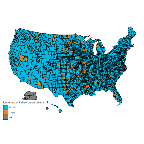
In particular, the original question is to understand these two maps, which show the counties in the first and last decile for kidney cancer deaths.

q = quantile(d$thetahat, c(.1, .9))
d$cancerlow = d$thetahat <= q[1] d$cancerhigh = d$thetahat >= q[2]
plot_usmap("counties", data=d, values="cancerhigh") +
  scale_fill_discrete(h.start = 200, 
                      name = "Large rate of kidney cancer deaths") 

plot of chunk unnamed-chunk-4

plot_usmap("counties", data=d, values="cancerlow") +
  scale_fill_discrete(h.start = 200, 
                      name = "Low rate of kidney cancer deaths") 

plot of chunk unnamed-chunk-4

These maps are suprising, because the counties with the highest kidney cancer death rate, and those with the lowest, are somewhat similar: mostly counties in the middle of the map.

(Also, note that the data for Alaska are missing. You can hide Alaska on the maps by adding the parameter include = statepop$full[-2] to calls to plot_usmap.)

The reason for this pattern (as explained in BDA3) is that these are counties with a low population. Indeed, a typical value for \hat\theta_j is around 0.0001. Take a county with a population of 1000. It is likely to have no kidney cancer deaths, giving \hat\theta_j=0 and putting it in the first decile. But if it happens to have a single death, the estimated rate jumps to \hat\theta_j=0.001 (10 times the average rate), putting it in the last decile.

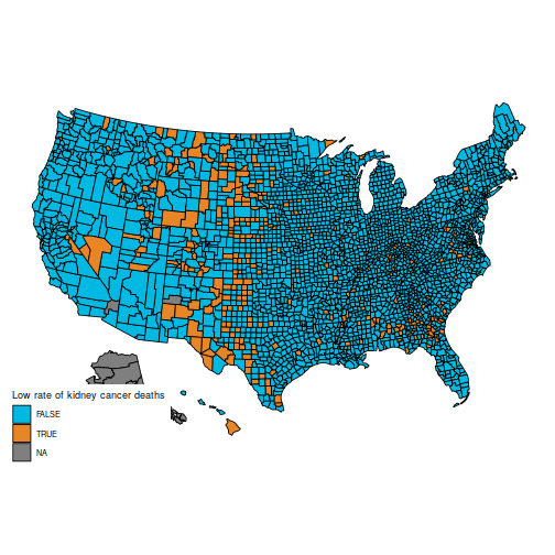
This is hinted at in this histogram of the (\theta_j):

ggplot(data=d, aes(d$thetahat)) + 
  geom_histogram(bins=30, fill="lightblue") + 
  labs(x="Estimated kidney cancer death rate (maximum likelihood)", 
       y="Number of counties") +
  xlim(c(-1e-5, 5e-4))

plot of chunk unnamed-chunk-5

Bayesian approach

If you have ever followed a Bayesian modelling course, you are probably screaming that this calls for a hierarchical model. I agree (and I’m pretty sure the authors of BDA do as well), but here is a more basic Bayesian approach. Take a common \Gamma(\alpha, \beta) distribution for all the (\theta_j); I’ll go for \alpha=15 and \beta = 200\ 000, which is slightly vaguer than the prior used in BDA. Obviously, you should try various values of the prior parameters to check their influence.

The prior is conjugate, so the posterior is \theta_j|K_j \sim \Gamma(\alpha + K_j, \beta + n_j)
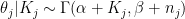
. For small counties, the posterior will be extremely close to the prior; for larger counties, the likelihood will take over.

It is usually a shame to use only point estimates, but here it will be sufficient: let us compute the posterior mean of \theta_j. Because the prior has a strong impact on counties with low population, the histogram looks very different:

alpha = 15
beta = 2e5
d$thetabayes = (alpha + d$dct) / (beta + d$pop)
ggplot(data=d, aes(d$thetabayes)) + 
  geom_histogram(bins=30, fill="lightblue") + 
  labs(x="Estimated kidney cancer death rate (posterior mean)", 
       y="Number of counties") +
  xlim(c(-1e-5, 5e-4))

plot of chunk unnamed-chunk-6

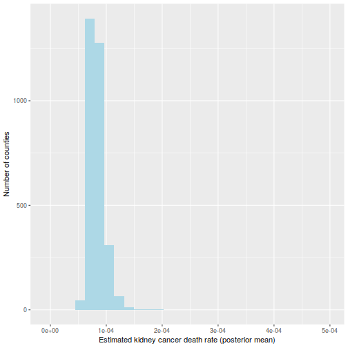
And the maps of counties in the first and last decile are now much easier to distinguish; for instance, Florida and New England are heavily represented in the last decile. The counties represented here are mostly populated counties: these are counties for which we have reason to believe that they are on the lower or higher end for kidney cancer death rates.

qb = quantile(d$thetabayes, c(.1, .9))
d$bayeslow = d$thetabayes <= qb[1] d$bayeshigh = d$thetabayes >= qb[2]
plot_usmap("counties", data=d, values="bayeslow") +
  scale_fill_discrete(
    h.start = 200, 
    name = "Low kidney cancer death rate (Bayesian inference)")  

plot of chunk unnamed-chunk-7

plot_usmap("counties", data=d, values="bayeshigh") +
  scale_fill_discrete(
    h.start = 200, 
    name = "High kidney cancer death rate (Bayesian inference)")  

plot of chunk unnamed-chunk-7

An important caveat: I am not an expert on cancer rates (and I expect some of the vocabulary I used is ill-chosen), nor do I claim that the data here are correct (from what I understand, many adjustments need to be made, but they are not detailed in BDA, which explains why the maps are slightly different). I am merely posting this as a reproducible example where the naïve frequentist and Bayesian estimators differ appreciably, because they handle sample size in different ways. I have found this example to be useful in introductory Bayesian courses, as the difference is easy to grasp for students who are new to Bayesian inference.

Black on black tooltips in Firefox with Kubuntu

I use Firefox on Kubuntu, and for a long time I had an issue with the tooltips: the characters were printed in black on a black background (a slightly different shade of black, but still very difficult to read).

I used to have a solution with Stylish, but it broke in Firefox 57 (Firefox Quantum). Here is a solution which works now, for anyone else with the same issue.

  • Navigate to ~/.mozilla/firefox/
  • Find your Firefox profile: a folder with a name like 1rsnaite.default
  • Navigate to ~/.mozilla/firefox/1rsnaite.default/chrome/ or whatnot (you might need to create the chrome/ folder)
  • Using your favourite text editor, open the file ~/.mozilla/firefox/1rsnaite.default/chrome/userChrome.css (creating it if necessary)
  • In this file, put the following code:
  • /* AGENT_SHEET */
    
    @namespace xul url(http://www.mozilla.org/keymaster/gatekeeper/there.is.only.xul);
    
    #btTooltip,
    #un-toolbar-tooltip,
    #tooltip,
    .tooltip,
    #aHTMLTooltip,
    #urlTooltip,
    tooltip,
    #aHTMLTooltip,
    #urlTooltip,
    #brief-tooltip,
    #btTooltipTextBox,
    #un-toolbar-tooltip
    {
     color:#FFFFFF !important;
    }
  • Save and restart Firefox.
  • If you have several profiles, repeat for the other profiles.

I am not an expert at these things; if this does not work for you, I won’t be able to help you any better than Google.

I used the following sites to find this solution:

Lecturer position in Statistics at Dauphine

An associate professor (“Maître de conférences”) position in Applied or Computational Statistics is expected to be open at Université Paris-Dauphine. The recruitment process will mostly take place during the spring, for an appointment date of 1 September 2017.

However, candidates must first go through the national “qualification”. This process should not be problematic, but is held much earlier in the year: you need to sign up by 25 October (next week!), then send some documents by December. Unfortunately, the committee cannot consider applications from candidates who do not hold the “qualification”.

If you need help with the process, feel free to contact me.

David Cox is the inaugural recipient of the International Prize in Statistics

David Cox was announced today as the inaugural recipient of the International Prize in Statistics.

My first foray into Statistics was an analysis of Cox models I did for my undegraduate thesis at ENS in 2005. I had no idea back then that David Cox was still alive and active; in my mind, he was a historical figure, on par with other great mathematicians who gave their names to objects of study — Euler, Galois, Lebesgue…

When I arrived at Oxford a few months later, I was amazed to meet him, and to see that he was still very active, both as a researcher and as the organizer of events for doctoral students.

David Cox is the perfect choice as the first person to receive this prize. I hope that the inauguration of this prize will help show the public that Statistics require complex and innovative methods, that have been tackled by some exceptional minds, and should not be seen as a “sub-science” compared to other more “noble” sciences.

MCMSki 4

I am attending the MCMSki 4 conference for the next 3 days; I guess I’ll see many of you there!

I am organizing a session on Wednesday morning on Advances in Monte Carlo motivated by applications; I’m looking forward to hearing the talks of Alexis Muir-Watt, Simon Barthelmé, Lawrence Murray and Rémi Bardenet during that session, as well as the rest of the very strong programme.

I’ll also be part of the jury for the best poster prize; there are many promising abstracts.

Corcoran medal

http://www.stats.ox.ac.uk/events/?a=6453Two weeks ago, I had the great honour of receiving the 2012 Corcoran memorial medal and prize for my doctoral dissertation. It is awarded by Oxford’s Department of Statistics in memory of Stephen Corcoran, a student who died in 1996 before having time to complete his DPhil. Being a Statistics prize, there is smoothing in the award process: it is awarded every two years, to a DPhil which was completed in the last four years (i.e. between October 2008 and October 2012 in my case). The ceremony was part of the Department’s 25th anniversary celebrations.

Nils Lid Hjort gave a lecture on his “confidence distributions”, a way to represent uncertainty in the non-Bayesian framework. Although he gave examples where his representation seems to work best, I wondered how this could extend to cases where the parameter is not unidimensional.

Chris Yau received the 2010 Corcoran prize and gave a short talk on applications of HMMs togenetic data; he was unlucky to have his 15-minute talk interrupted by a fire alarm (but that allowed me to wonder at how calmly efficient the British are at evacuating in such situations). Luckily, my own talk suffered no such interruption.

Peter Donnelly demonstrated once again his amazing lecturing skills, with a highly informative talk on statistical inference of the history of the UK using genetic data.

All in all, a very enjoyable afternoon, which was followed by a lovely dinner at Somerville College, with several speeches on the past, present and future of Statistics at Oxford.

Thanks again to the Corcoran committe, especially Steffen Lauritzen, for selecting me as the prize winner!

Expect some blog posts in French

This is just a warning that from now on, a small proportion of my blog posts will be in French. I’ll use French for posts which I think will appear primarily to French speakers: either posts for students of courses that I give in French, or posts on the French higher educational system which would be of little interest to people outside of France. I guess this is similar to what Arthur Charpentier does.

In particular, I’ll keep posting in English for anything related to my research topics.